Nicola Campbell, 93 Digital
Don’t panic! (Matt – well maybe panic a bit. Try it on a staging copy of a website first. Don’t blindly upgrade on live.)
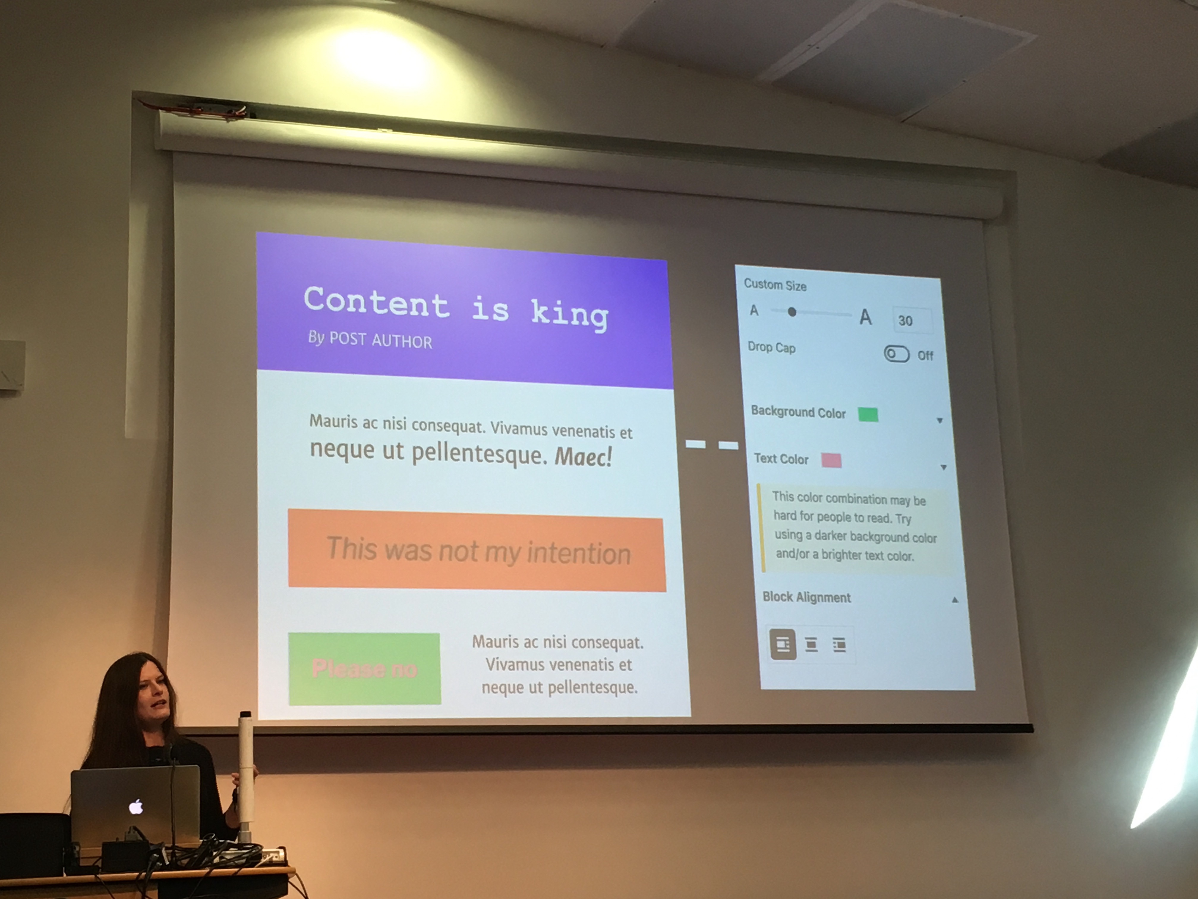
Dropcaps, backgrounds and separators. Pull quotes more easily placed within text.
Shortcodes won’t break. Probably.
Handing over too much control to users? Colours not in line with the brand or design.
Some accessibility cues, e.g. for colour:
Blocks and views is a more appropriate design language than pages and posts. Be aware of different use cases of blocks.
Final point: prepare your clients.
(Matt – Gutenberg is exciting, no doubt, but with so many WordPress websites in the wild I am bit skeptical that’ll all be just fine.)