|
|
|
Screen aesthetics are paramount. Colour is necessary for realistic images of people, scenes or 3-D objects in video games. Its use in non-game environments arouses debate over its interpretation and appropriateness. This stems from the fact that conventions on colour use are contradictory; for instance, electricians, drivers, cartographers, chemists and financiers all use colours for differing meanings.
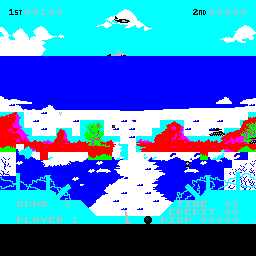
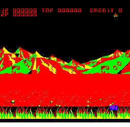
These first two represent poor use of HCI design. Both display an uninviting, confusing, and somewhat abstract interface, making them hard to decipher detail, and read even the score in the case of "Aeroboto."
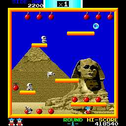
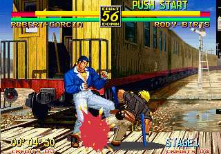
These two illustrate effective HCI design. In "Bombjack" The border demonstrates the field of play, and the digits are clear and obvious. "Art of Fighting 3" has a realistic art portrayal, enhancing and maximising the 3-D effect. Overall these two are convincing and inviting.
Colour is easily misused and is unreliable as a solitary cue. This stems not only from its interpretation by different hardware, but also by the 8% of UK population who are colour blind - the majority of these being red-green affected. Colour coding essential information would therefore be wasted on such users. Nevertheless users appear to prefer colour to monochrome displays, even if there is no measurable advantage in terms of user performance. So be consistent, and if necessary explain code meanings in online help. |